Fitness App
SwolTime
SwolTime is a fitness tracking app that focuses on user created workouts, analytics based timer, and overall health tracking

Team
Team Swol (4 UX Designers)
My Role
UX/UI Designer
Duration
3 week sprint
Tools
Figma, Figjam, Slack, Optimal Sort, Zoom, Toggl
Challenge
In this app redesign, my team and I redesigned the SwolTime app with a set of brand new features. These include a seamless end-to-end flow for a user to create, edit and execute workouts. I designed and prototyped the landing and analytics pages, and prototyped a working timer interaction.

Research and Synthesis
User Research
In addition to heuristic evaluations, I conducted four user interviews and contextual inquiries to better understand customers’ motivations and behaviors.
I learned the following:
Shoppers prefer supporting small businesses and seek unique, personalized gifts
An intuitive navigation and filtering system enhances the shopping experience
High-quality images from multiple angles are essential for their purchasing decisions
Detailed product descriptions and customer reviews help build trust
A fast seamless checkout process with digital payment options is crucial
Personalized recommendations and product suggestions help indecisive shoppers
Users appreciate features that make finding and selecting the perfect gift easier
Lengthy checkouts discourage purchases
Shoppers appreciate a streamlined homepage that showcases new arrivals, bestsellers, and easy-to-browse categories.
Connecting the Dots
Affinity Map
With a clearer view of user needs, I organized the interview insights using an affinity mapping method. I grouped similar thoughts together, and several patterns emerged
The User
Avery B
Age: 42 Occupation: ER Nurse
Family: Married, Mother of 2 year old
Background:
Avery is a dedicated wife and mother who juggles a high-pressure job. While she is passionate about her work, she also values functional fitness and the health of her family.

Frustrations
Overwhelming choices Doesn’t have an efficient way to plan workouts.
Recently changed careers to become an ER nurse, now has a demanding schedule
Has noticed that it is more difficult than before to lift heavy weights (i.e. patient transfers)
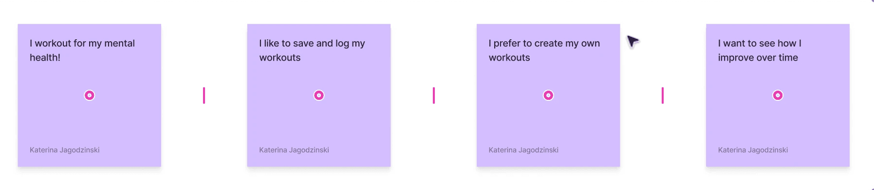
Needs
Needs to be able to construct a new workout routine quickly, in 2 minutes or less
An easy way to retrieve info from previous workouts
To see progress over time
Goals
Make informed workout plan
Features to streamline her workout( search, filter, description, save workout, timer, )
Three clicks or less process per exercise/Timer setting
Problem Statement
Avery prioritizes her functional fitness, but she is also a busy mom and ER nurse and has many demands on her time. Avery needs a better way to plan and execute her workouts, while also keeping track of her progress over time.
The Lift Off
Comp Analysis
With Avery's needs in mind we began collecting Comp Analysis from top competitors

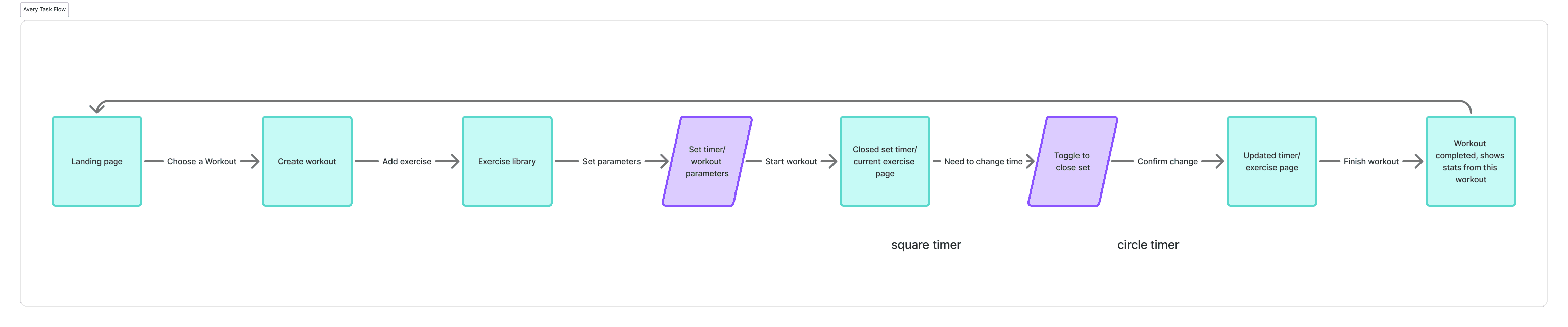
Task Flow
From there, we mapped out the journey Avery would take in a real life scenario of running short on time for her workout —from landing on the homepage to building her workout, to discovering changes would need to be made as a new time crunch hit. This guided the features we prioritized in design: filtering, exercise library, timer page, toggle to switch from timing just rest time to timing the actual workout, to completion and analytics.
Sketches
Through Sketching different ideas for the layout of the new app reflecting Avery's needs and common design patterns that we found during our competitive and comparative analysis. As well as factoring in issues discovered during heuristics analysis. We also got client feedback on his design requirements.

Wireframe
After identifying the wireframes that best aligned with our clients goals and needs, as well as Avery's we developed a series of mid-fidelity wireframes in Figma. These included the Home Page, Exercise Library, Workout Creation Page, Exercise Detail Page, Analytics, and Timer, establishing the foundational layout and structure of the website.

Usability Testing
To validate our design, we conducted 3 usability tests to evaluate our frames interaction, and ability to achieve end goal in under 2 minutes, per the request of the client. We asked each participant to follow our task flow and each user was able to complete their task successfully in under 2 minutes. We observed each participants screen as they clicked around on the prototypes, and asked them to share any thoughts or feelings that came up. Below is the feedback we were able to apply from each user.
1.
Add name of workout to in workout page
Add favorite created workouts in future changes
Make circles behind the calendar bigger
2.
Would like end button to be bigger
Need to increase contrast on bottom nav button
A lot of information but it conveys it well
3.
Switching from timed to untimed was a little confusing
How does the user know this is a saved routine now?
Why is one edit window dark and the other is gray?
The Work behind the Wonder
HiFi
With those updates implemented, we developed high-fidelity prototypes in Figma. Our focus was to bring the existing aesthetic of SwolTime to life in a more user friendly and simple format —through color palette, powerful typography, and thoughtful spacing. We kept the SwolTIme feel alive in an updated package.
Learnings
This project helped me learn the joys of working on a fully collaborative team. With each member taking on equal roles throughout the entire process I was able to develop my skillsets past their existing marks, develop a strong understanding of Figma, but also to build upon my existing Research and Writing abilities. Watch out as we LIFT into the new iteration of SwolTime!
The Outcome
Our client loved the design updates, new features, and overall updated SwolTime experience! He has begun developing the app into SwolTime 2.0 and kept myself, and my team up to date as he does.